This project focused on designing the packaging for a new energy drink. The client sought a unique can design that would stand out in the energy drink market, appeal to health-conscious consumers, and challenge common perceptions about energy drinks.
I successfully met the client’s brief by creating packaging that positions the drink as a healthier alternative, grabs attention, evokes positive emotions, and differentiates it from competitors.
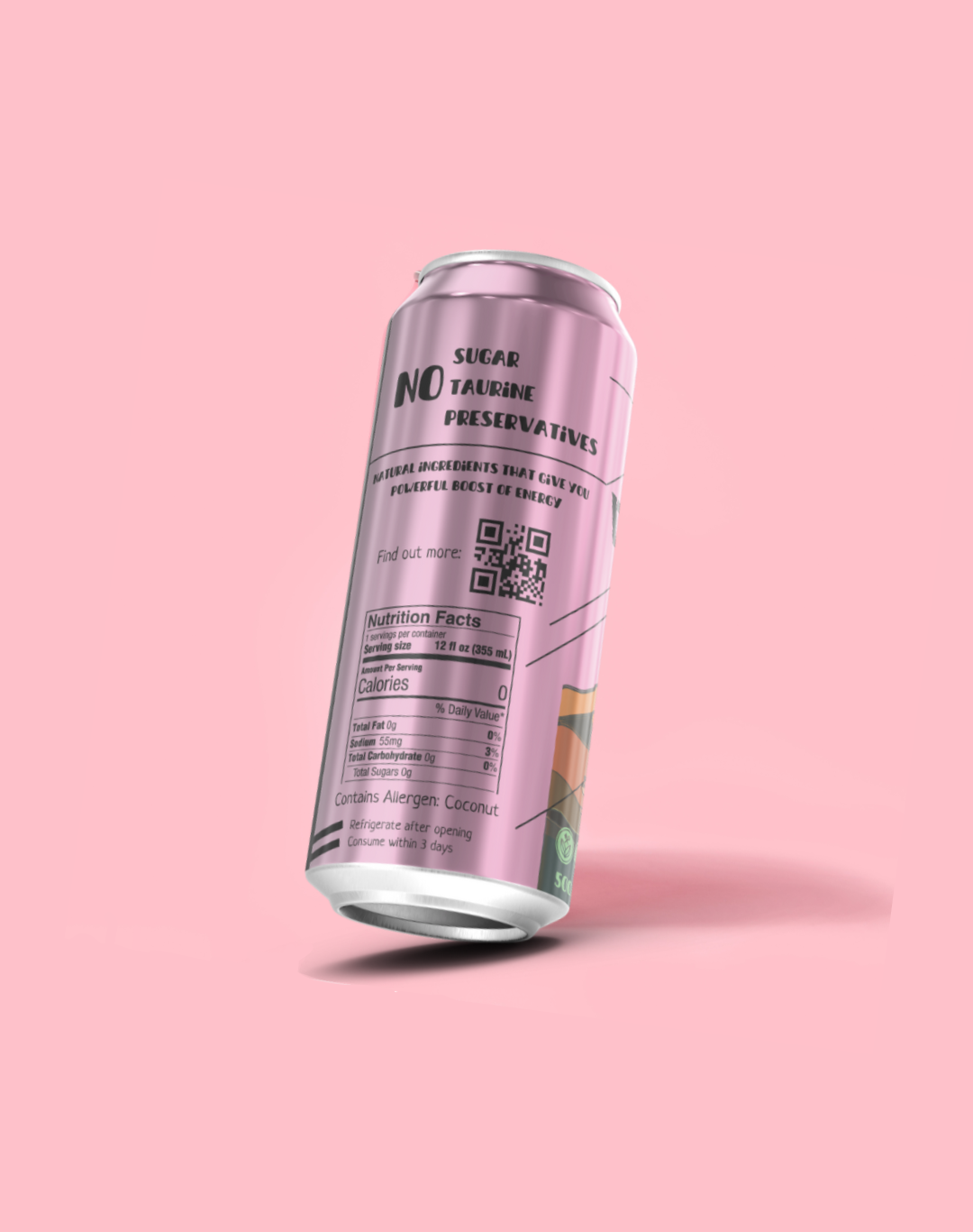
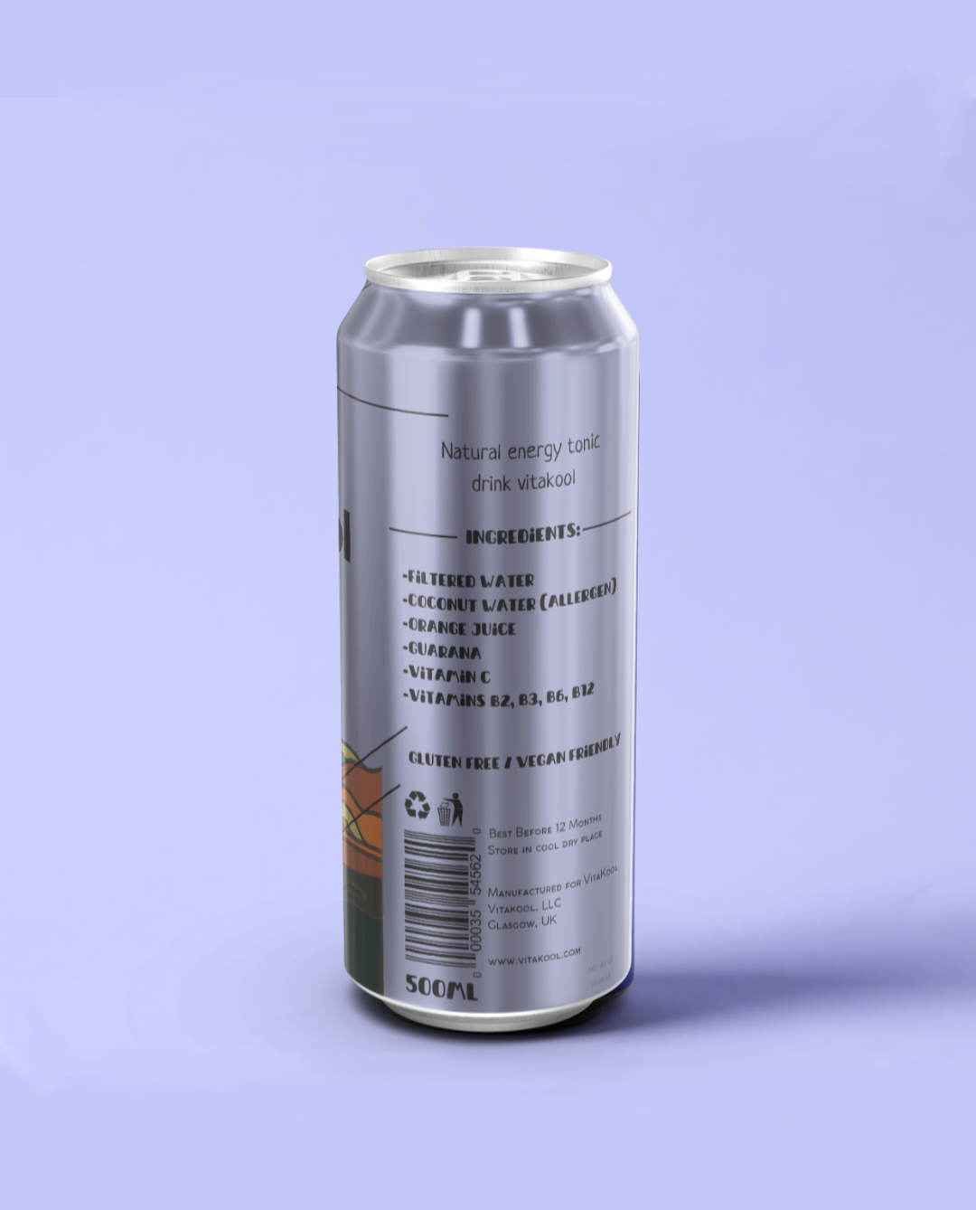
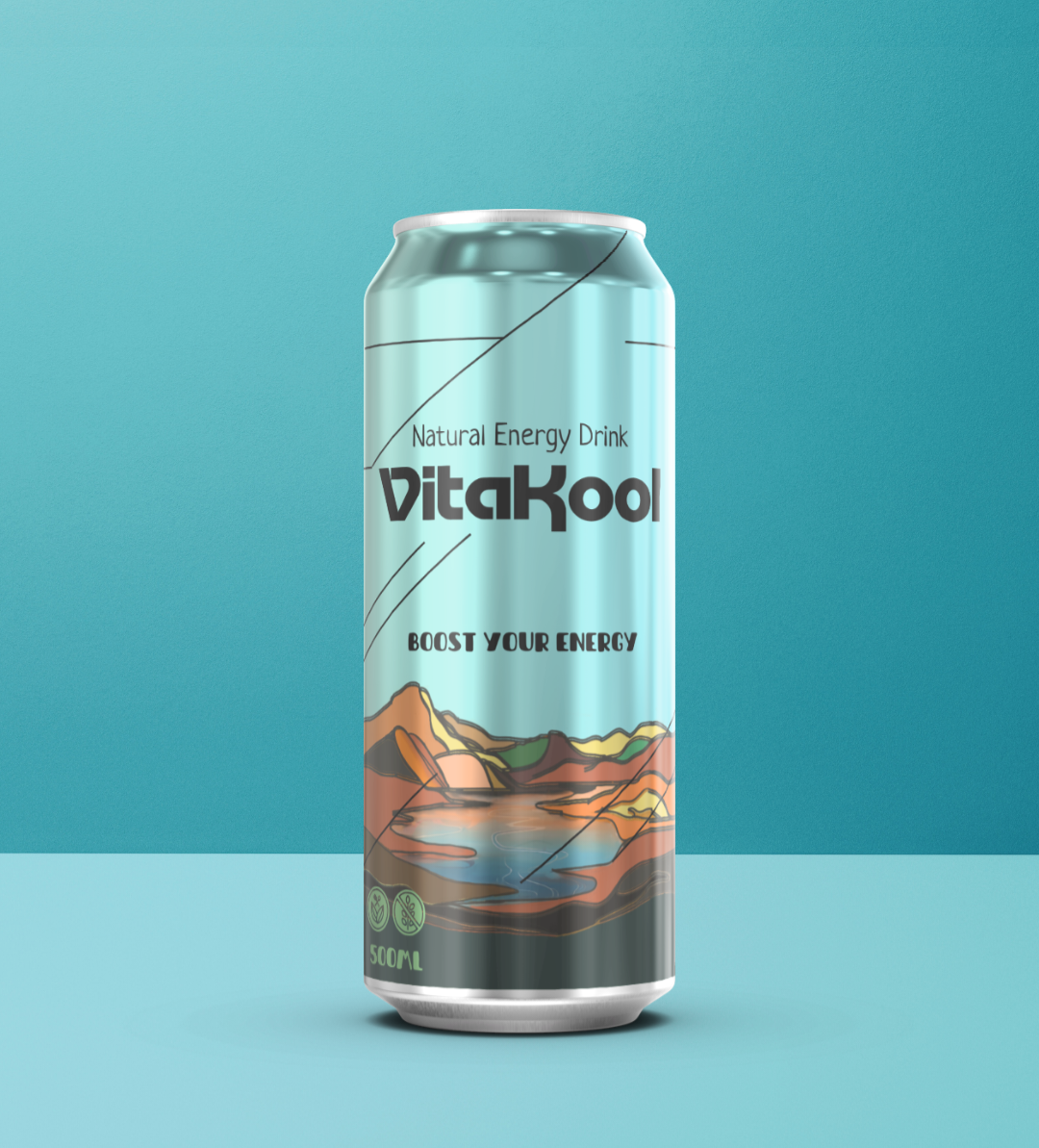
This result was achieved by incorporating four key elements into the packaging that effectively communicate the brand’s identity and purpose. These elements prominently highlight the absence of taurine, preservatives, and sugars, while also emphasizing that the drink is natural, vegan-friendly, and gluten-free. Most importantly, the design promotes the beverage’s health benefits and low-calorie content, reinforcing its role as an energy-boosting option for overall well-being.
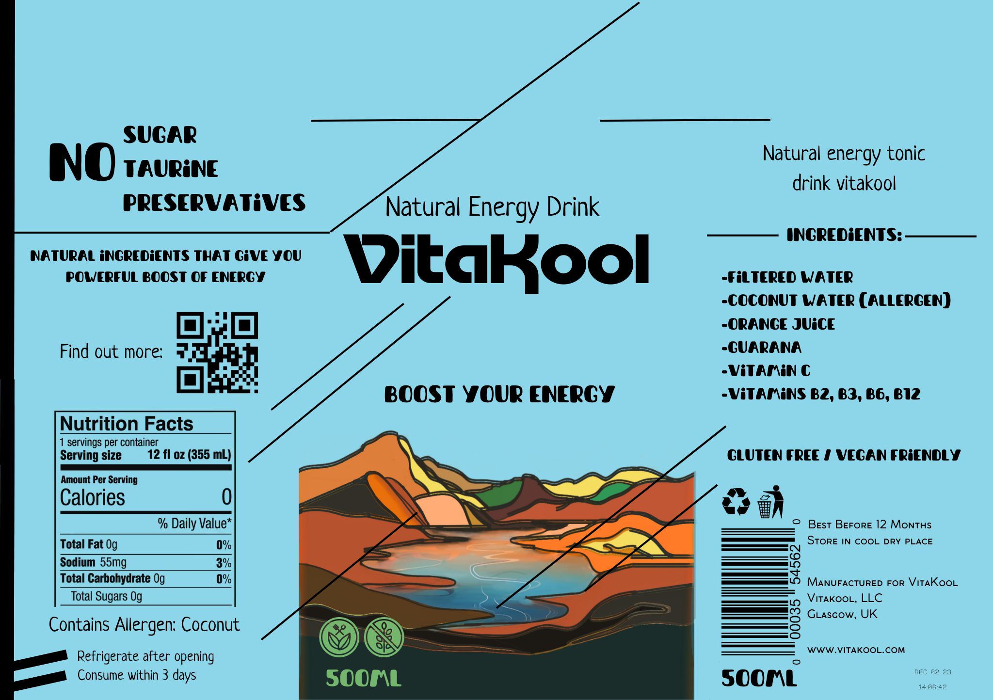
The packaging also serves as a powerful tool for conveying the brand’s message through imagery, typography, and color choices. Energetic shades of cyan, pink, and purple were selected as the primary colors, while dark green (symbolizing nature) and vibrant orange (representing health) were incorporated to create a visually striking yet minimalist design. This carefully curated color palette ensures strong shelf presence, making the product easily identifiable in stores. Additionally, the design aligns with both the UK market and broader EU regulations for energy drinks.